Amsterdam Design Report: Conservatorium Hotel
Irwin Weiner ASID - One of the most exceptional hotels Jay and I have ever stayed in was the Conservatorium Hotel in Amsterdam. Today I'd like to cover the overall hotel and lobby, but tomorrow I'll talk about our room and some of the hotel's amenities.
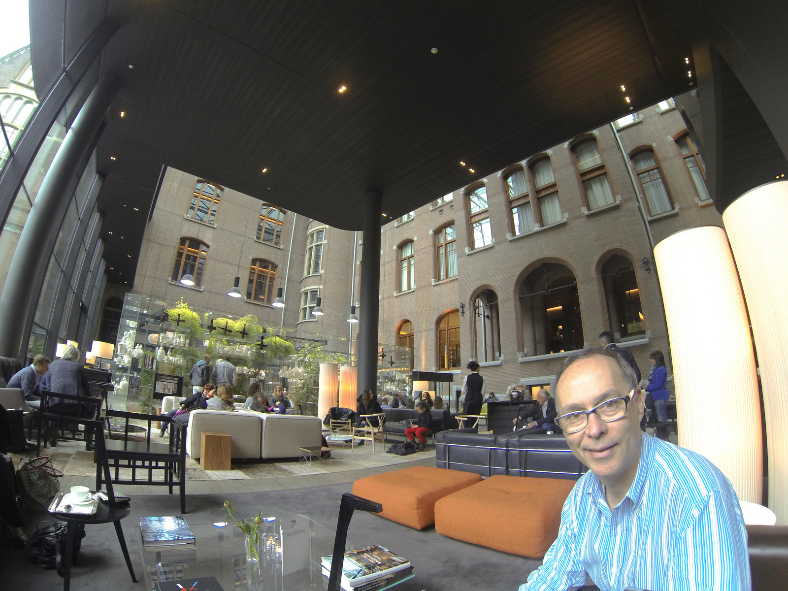
Evident from the moment we walked into the lobby was the casual contemporary style of the furnishings and accessories. There was nothing fussy, no attempt to coordinate and match, or to call too much attention to any one piece of furniture. A few classic pieces, like a chesterfield sofa looked perfectly at home with boxier modern sofas.
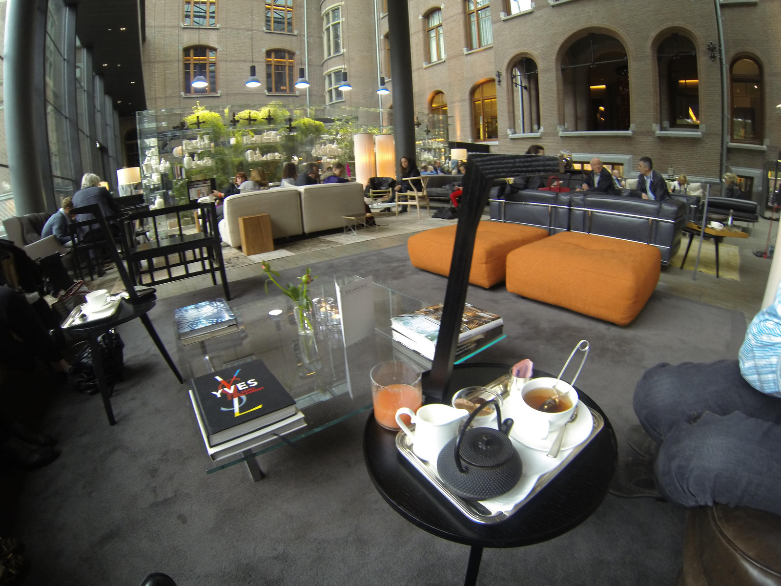
Everything was comfortable and low-slung. (Not the friendliest height for the elderly or people with disabilities, but beautiful nonetheless.) White Dutch ceramics were on display in breathtaking floating glass shelves (the shelving must have cost a fortune). Mismatched rugs anchored casual conversation groupings. We noted guests relaxing in the lobby as well as small gatherings of people doing creative business presentations; we sat next to two women from a Milan fashion house showing their latest collection to a woman representing a Dutch fashion magazine.
I noted the extremely low height of the coffee tables. In a huge open lobby space, the on-purpose small scale of the furniture groupings and lower sizing of objects shouldn't have worked, in theory, but they were brilliant and created needed intimacy in the space. The dark overhang of the contemporary entrance addition also helped to make the lobby seating area a bit cozier, too (even though the ceiling height was soaring). After arriving from the airport, we settled in for cups of steaming hot tea, freshly squeezed ruby red grapefruit juice, and a plate of the ubiquitous savory Dutch meat snack, bitterballen.
The hotel project was created by famed architect and furniture designer Piero Lissoni and the historic musical conservatory building was transformed into a boutique hotel that marries the best of classical style with contemporary furnishings and amenities. It was fun to see the new addition details working in play with the outside of the old music conservatory building. It was a brilliant design.
Let's take one small detail: the doors. All new interior doors were clad - both sides - in stone to seamlessly mesh with the stone walls. Can you imagine the heavy-duty hinges required to keep them hanging upright and plumb! Let me tell you that opening and closing these doors was a feat of strength. Definitely not a universal design touch; in fact, we joked about the front desk being deluged with calls from older guests who needed help to open their bathroom doors. (More on those doors in tomorrow's post.) Enjoy this promotional video overview for the Conservatorium Hotel.


